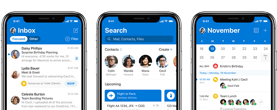
Microsoft’s popular email client has received a brand-new update for Apple devices. Outlook for iOS now has a brand-new design that breathes new life into the notable third-party email client. It also receives newly customisable swipe gestures, deeper integration of the calendar, and more.
The redesigns have been rolling out to select users since it was announced late last year. Last month, however, many users on Twitter and Reddit started to report that they have received the new design. This became more prevalent as the month rolled on, with a sudden upsurge when version 3.8.1 hit the Apple App Store.
According to Microsoft, Outlook for iOS is now faster than ever. The Redmond-based company states that “design is becoming the heart and soul of Office”. This is why they wanted to, first and foremost, push out the new design for Outlook before the others.
The company states that “great mobile experiences don’t just shrink desktop designs”. Instead, they “rethink the process by understanding mobile’s unique design opportunities and constraints”. This explains why Microsoft Outlook has exceeded more than 100 million iOS and Android downloads since its release on the respective platforms. Microsoft explains that the “proximity and immediacy” that apps have with mobile users “create the need for more personal, efficient, and even playful experiences that require a mobile-first approach”.
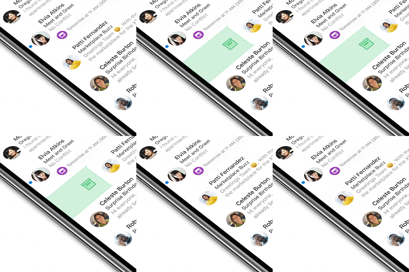
While the official update log on the App Store only features the usual “performance improvements and bug fixes” description, the official product announcement has a lot more to offer. According to the company, the new design brings with it a new sensory feedback system. When users swipe right or left on an email, subtle changes in colour, shape and iconography unfold. Hard-edged corners change to soft and round, “metaphorically pulling those items away from the message list and sending it where you want it to go”.
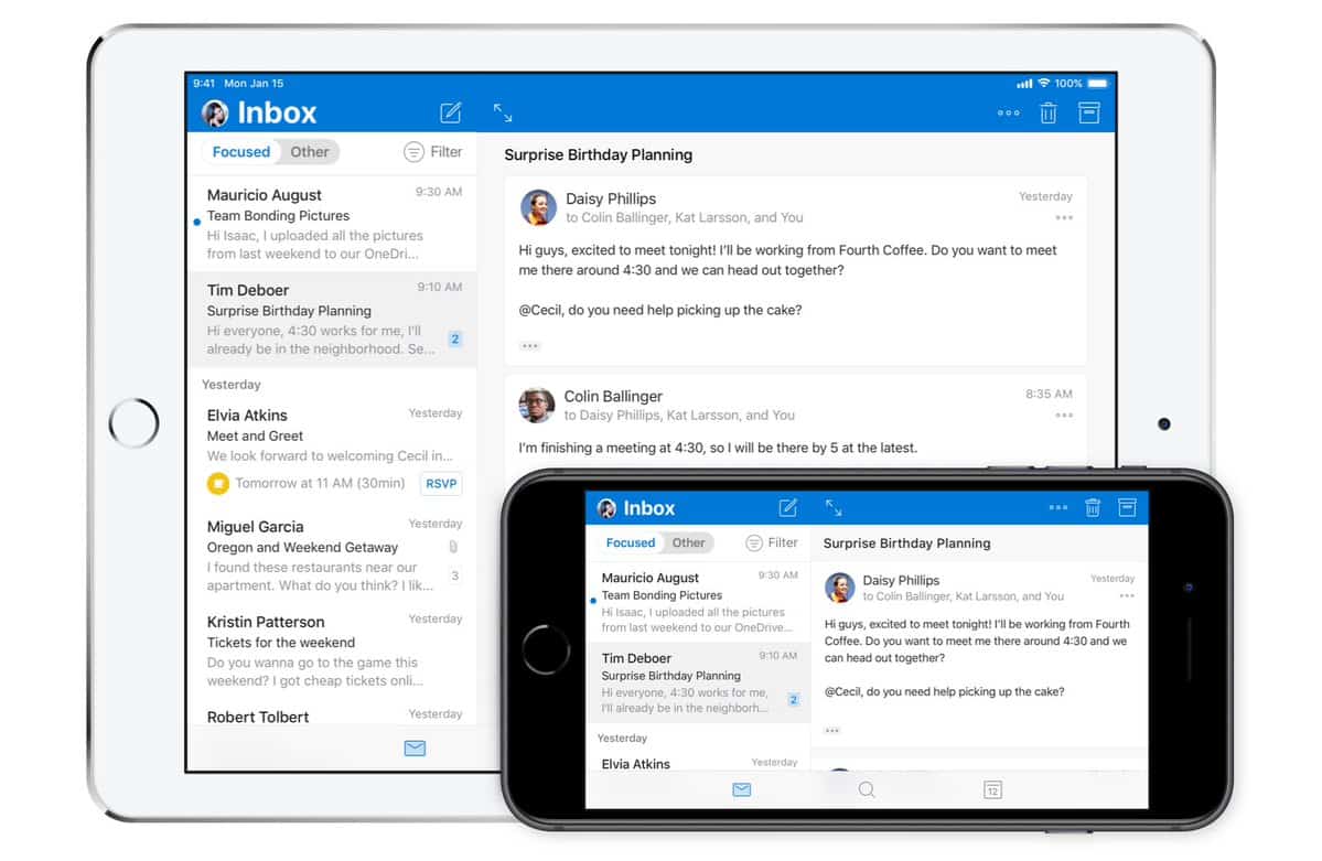
The new design is also focused on speed. The company states that the “strong app header with bold colour and typography” helps users easily find their way to different aspects of the app. This lets users quickly complete their tasks and get back to what matters. Furthermore, this experience remains a constant between mobile email, search, and calendar. Microsoft also says that the bold header will connect users who use the “larger screen” versions of the app in order to offer a sense of familiarity.
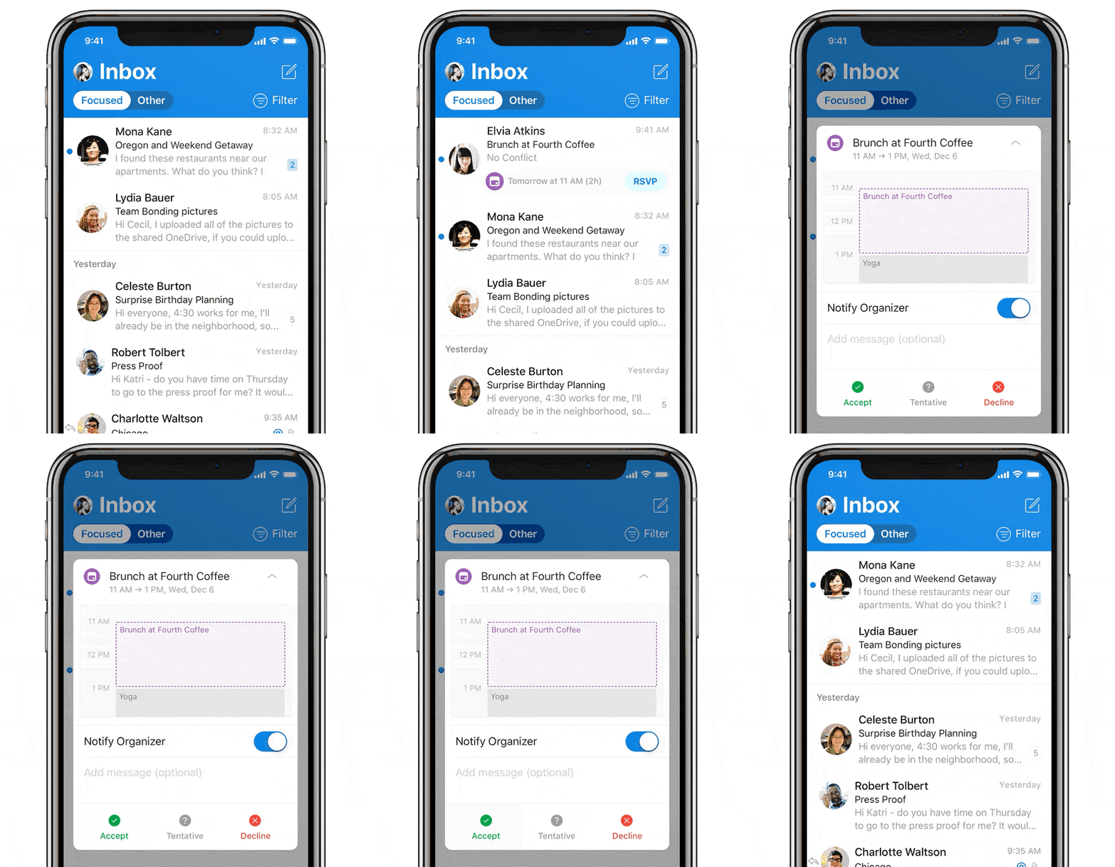
I, for one, welcome the new design that Outlook for iOS now features. I have personally enjoyed the new aesthetic for a few months and can say with certainty that the app has improved. The app is free for all iOS and Android users and supports multiple email accounts. It is a vastly superior app compared to the stock Mail App, and stands up to the likes of Airmail.
[Sources: Express UK, iMore, Microsoft (official site), MS Power User, NDTV Gadgets]
Junior Editor at Vamers. From Superman to Ironman; Bill Rizer to Sam Fisher and everything in-between, Edward loves it all. He is a Bachelor of Arts student and English Major specialising in Language and Literature. He is an avid writer and casual social networker with a flare for all things tech related.

