Rare, Dlala Studios and Microsoft took the veil off their long-awaited Battletoads remake at E3 2019, and it looks glorious. The footage shown on stage during the Microsoft Xbox E3 conference ticked all the boxes longtime fans of the franchise wanted to see; except maybe one: art direction. Hence why I will be looking at Battletoads design in this article.
If you compare the Battletoads reveal trailer with any footage of the original Battletoads, you will notice one huge difference: the character designs. Granted, design overhauls can be great, but only when done properly. Most rebooted franchises usually keep the designs modern and fresh, while still paying homage to the originals. This way, the franchise may even be noticed by newcomers. Alas, these changes may also alienate old fans of the franchise, especially when they are extreme in nature. This is the case with the new Battletoads design, and some fans are not pleased.
From the moment that the trailer went live on YouTube, fans have raised their concerns on Twitter.
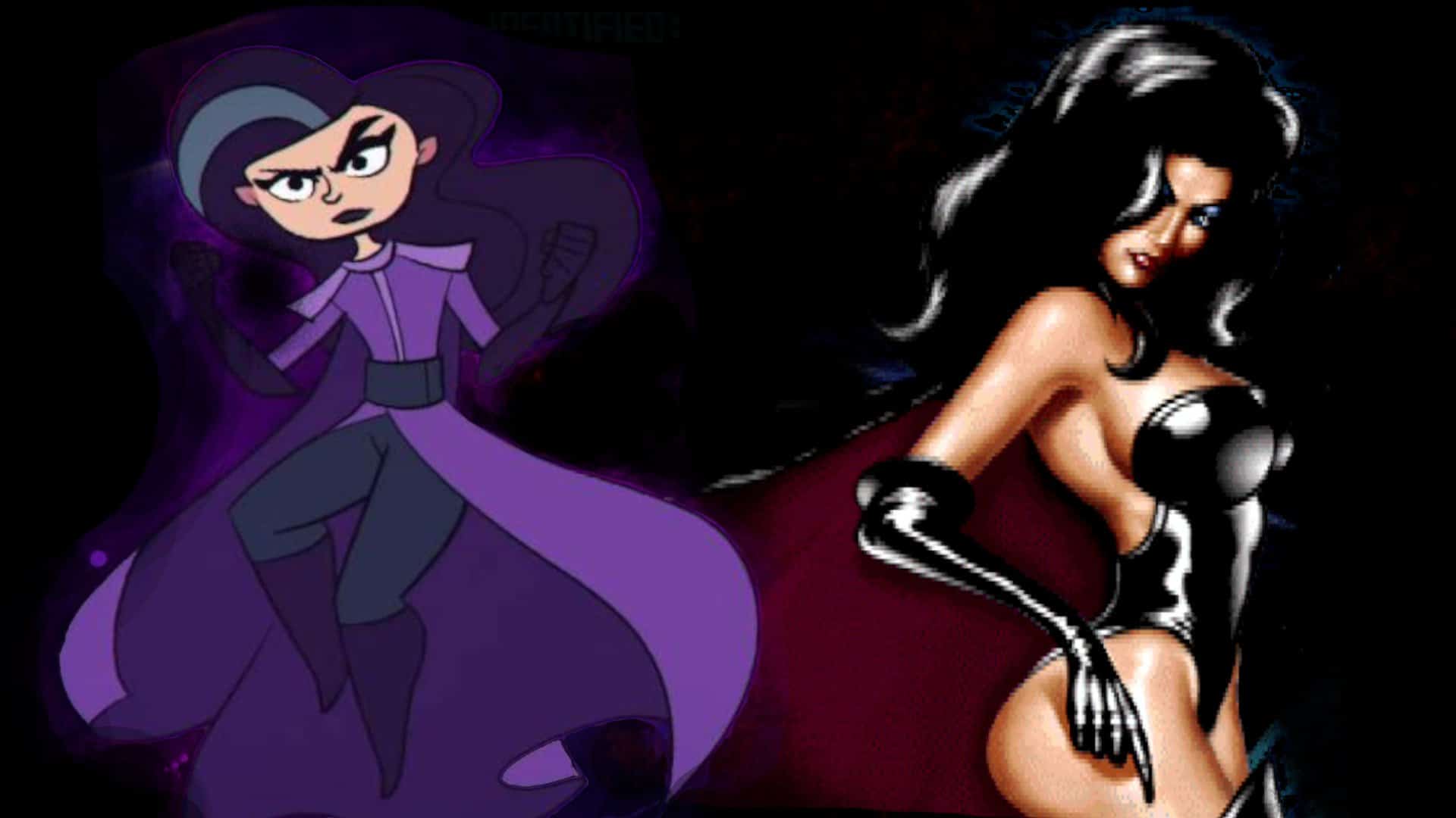
Many fans skewered the art change out by pointing out how much Dark Queen has changed. In the 1991 original and its various spin-offs, Dark Queen was portrayed as a busty, skin-tight, one-piece wearing diva. She was a proper dominatrix that would always get her way. The new Dark Queen, however, looks like she was ripped straight out of a Nickelodeon or Disney cartoon. In fact, with the new Battletoads design she seems like she was pulled directly out of something like Kids Next Door!


The Dark Queen’s redesign aside, it must also be noted that the concerns are not just because a sexualised character got redesigned. Instead, people are equally as furious about the new Battletoads design when looking at the other characters. The main characters, for instance, look like they were ripped from other cartoons. In fact, I swear a few characters featured in Twitter user @Votaconunclick’s tweet, look suspiciously like a character or two you would find in a Bugs Bunny or LooneyToons cartoon.
While I would not necessarily call the new Battletoads design “soybased trash” like some users on social media, I will admit that I very much preferred the original, and somewhat edgier art direction.


I would say that the biggest difference between the old art direction and the new one is the move toward bolder and more colourful designs. Characters are made to look cleaner and more cartoony, because that is the natural evolution that modern cartoon aesthetics have adopted. A good example of this would be Ben10, and perhaps even the likes of Teen Titans – two shows which have very similar aesthetics to the likes of the new Battletoads.
There are, of course, shows like Samurai Jack or perhaps even Dragon Ball, which go against the grain. Both of these shows recently aired brand-new content that looked almost exactly the same as their original counterparts. Of course, there are slight changes, such as cleaner line work. Overall, however, they are essentially the very same products. With this in mind, one has to ask why have Microsoft move into this bold new Battletoads design direction in the first place? I would hazard a guess and say that the sole reason for this change was to make it way more accessible to younger audiences. There is no denying that children who played the game in 1991, and children who play the game today, are growing up in vastly different climates.
Then again, is it really that bad? A whole different side of Twitter reveals that there is hope for the game to be well received. A few Twitter users have publicly expressed their love of the new Battletoads design, while others who never even knew about the original’s existence, just accepted it outright. Is this a sign of the times, or is it just a matter of people who cannot let go of beloved characters? Do you think that Rare and Dlala Studios should have been more conscientious toward their veteran fans? I certainly do… but at the end of the day, it is not about what I want, but what is best for business.
[Sources: Twitter, YouTube(1)(2)]

Junior Editor at Vamers. From Superman to Ironman; Bill Rizer to Sam Fisher and everything in-between, Edward loves it all. He is a Bachelor of Arts student and English Major specialising in Language and Literature. He is an avid writer and casual social networker with a flare for all things tech related.
- Edward Swardthttps://vamers.com/author/edwardswardt/

- Edward Swardthttps://vamers.com/author/edwardswardt/

- Edward Swardthttps://vamers.com/author/edwardswardt/

- Edward Swardthttps://vamers.com/author/edwardswardt/

- Edward Swardthttps://vamers.com/author/edwardswardt/

- Edward Swardthttps://vamers.com/author/edwardswardt/

- Edward Swardthttps://vamers.com/author/edwardswardt/

- Edward Swardthttps://vamers.com/author/edwardswardt/


